Thumb-First Thrills: Why Crash Games Like Aviator Fit Short Sessions

Crash games land with gamers because the loop stays tight. You stake, the multiplier rises, and a round ends at an unknown point. You choose a cash out moment under pressure, then you see the result right away. That single decision feels like a skill check, even when the core outcome still comes from a random draw.
Phone design makes that loop sing. Big targets cut mis taps. A clear number readout survives glare and motion. A short countdown keeps attention narrow, so a session fits into the gaps that real life hands you, like a bus stop, a lift ride, or the time a mate takes to find their keys.
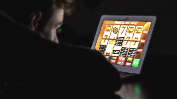
The Aviator game sits inside this pattern as a popular crash title from Spribe, and it shows up across many operator lobbies in multiple markets, including parts of Africa and the United States where local rules allow the product. The same core loop travels well because it asks for two quick taps and one real choice, which suits thumb play on a small screen.
Short rounds that match phone habits
Mobile gaming rewards designs that respect small time blocks. A GameAnalytics mobile benchmarks report summarises that median session length for many mobile titles sits around 5 to 6 minutes, while top performing games often reach around 8 to 9 minutes. A crash format can deliver several complete rounds inside that window, so you get repeated feedback instead of one long build up.
That pace also fits sports viewing. A fan watches a drive, checks a score app, then looks down again during a timeout. Crash rounds slot into that rhythm because they resolve fast and restart fast. You do a round, you pocket a result, you return to the match, and the flow stays intact.
The humour comes from how serious the moment feels for such a small action. A single thumb hover can carry the same tension as a final shot in a close game on TV, with the crowd replaced by a quiet phone screen and a rising number that keeps daring you to wait.
Why one button beats a busy interface
Crash layouts usually put the main control in one place and keep it there. That stability matters on a handset because your grip shifts as you walk, sit, or lean. A stable button location lets muscle memory do the work, and that reduces friction during the high tension second where you decide to cash out.
Research on one-handed thumb interaction has tested how touch key size and location affect accuracy. Results like these support a common design choice: keep primary controls large and place them in the easy reach area for one handed use. Crash formats benefit from that because the interface needs very few controls, so designers can prioritise reach and clarity.
A clean interface also avoids cognitive overload. You track one rising value and one action state. That feels closer to a quick reflex game than to a complex sim. Many gamers prefer that during short sessions, since the brain gets a complete loop and a clear endpoint.
The curve, the risk, and the gamer brain
The rising multiplier in Aviator game works like a progress meter that can snap. That visual creates tension fast, and it stays readable at a glance. It echoes familiar game moments where a bar climbs and you choose when to commit, like timing an ult or grabbing loot while the zone closes, except the choice compresses into seconds.
Minecraft offers a useful parallel in miniature. You can spend hours building, yet you also get short bursts where you dive into a cave, grab resources, then race back up before trouble catches you. Crash rounds deliver that same risk pulse in a shorter loop, which fits a phone break and still feels game like.
Market numbers explain why studios chase formats that thrive on phones. Newzoo estimates the global games market at $188.8 billion in 2025, with mobile at $103.0 billion, or 55% of revenue. Habits drive that share, and habits favour games that fit into short, repeatable sessions.
Social cues packed into a tiny space
Many crash titles show a live list of other players and their cash outs. That feed turns a solo loop into a public moment. You see early exits, late rides, and big multipliers land in real time, and that shapes how you feel about your own timing.
This works well on a small screen because the feed can sit in a narrow column while the main curve stays central. Your eye flicks between two zones and returns to the action button. Good layouts keep contrast strong and spacing clean so the feed adds energy instead of clutter.
Spribe’s own Aviator game description frames it as a social multiplayer game built around an increasing curve that can crash at any time, and that matches the core experience players see in the interface. The product leans into quick shared moments rather than long solo marathons.
Practical ways to keep sessions sharp
Treat each stake as a single round budget. That keeps decisions simple and makes session length predictable. You can fit a few rounds into a break and stop on schedule, which matters when play sits alongside work, commuting, and watching sport.
Pick a default cash out point for a while and stay consistent. Think of it like running one loadout for several matches so you learn its feel. Once you see how swings behave, you can adjust your target with intent rather than impulse.
Use the smallest layout that still shows the key info. Hide side panels when the lobby allows it, keep brightness high outdoors, and keep the cash out control inside comfortable thumb reach. These small choices improve control, and control makes the loop feel smoother.